Thompson
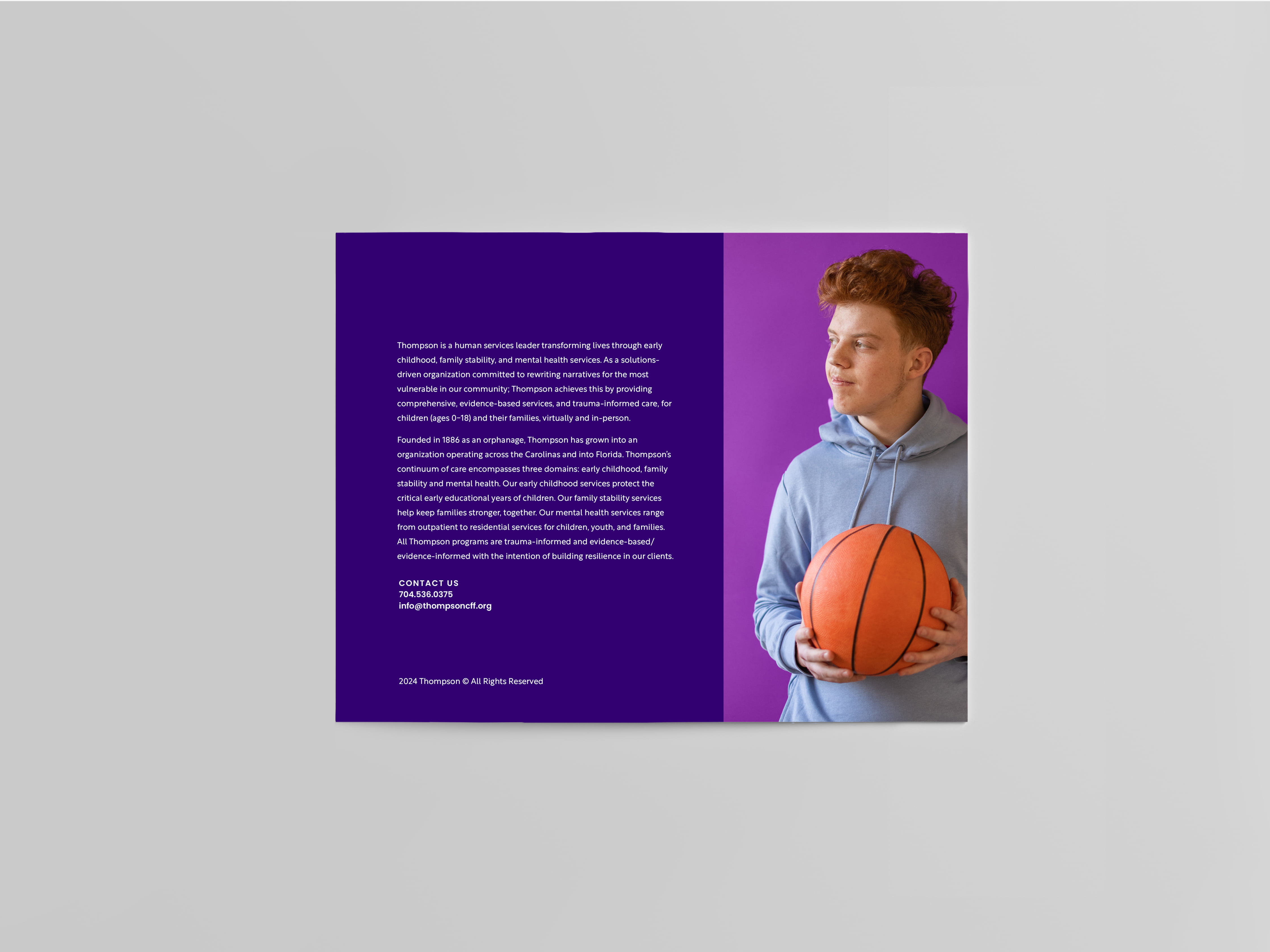
Founded in 1886 as an orphanage, Thompson is now a non-profit that operates across the Carolinas and into Florida. Thompson’s continuum of care encompasses three domains: early childhood, family stability, and mental health. All Thompson programs are trauma-informed with the intention of building resilience in children, families, and the communities they serve.
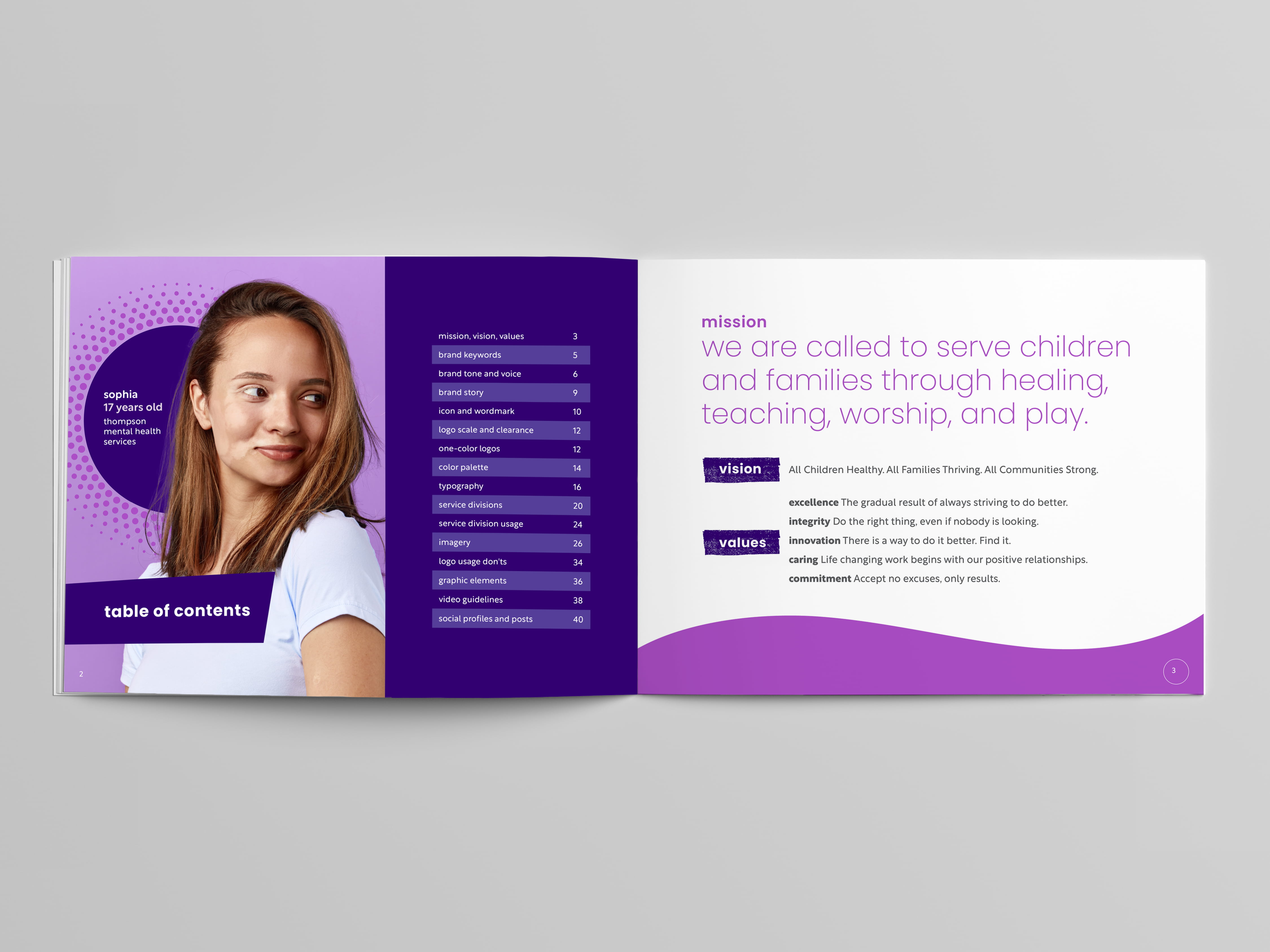
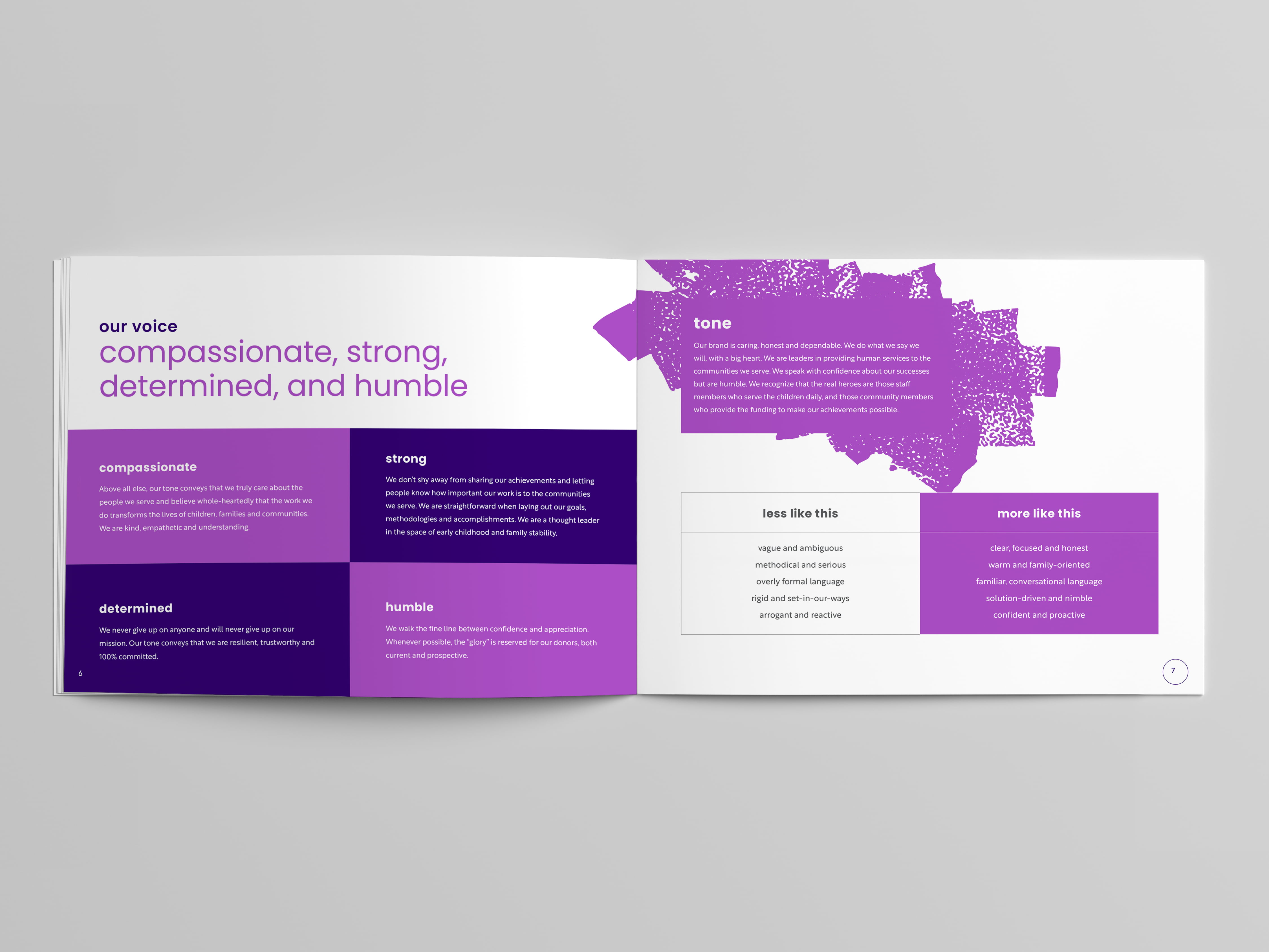
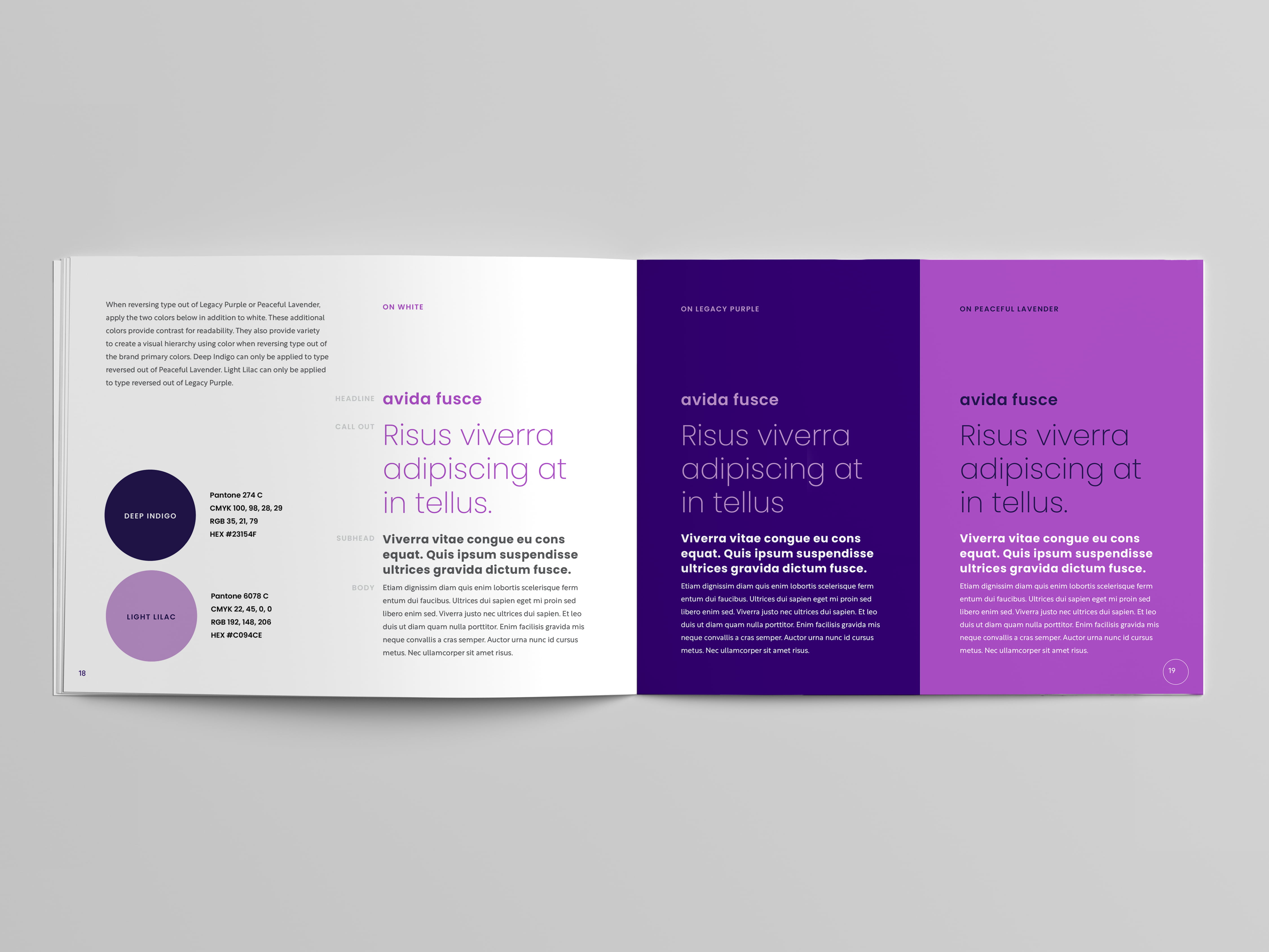
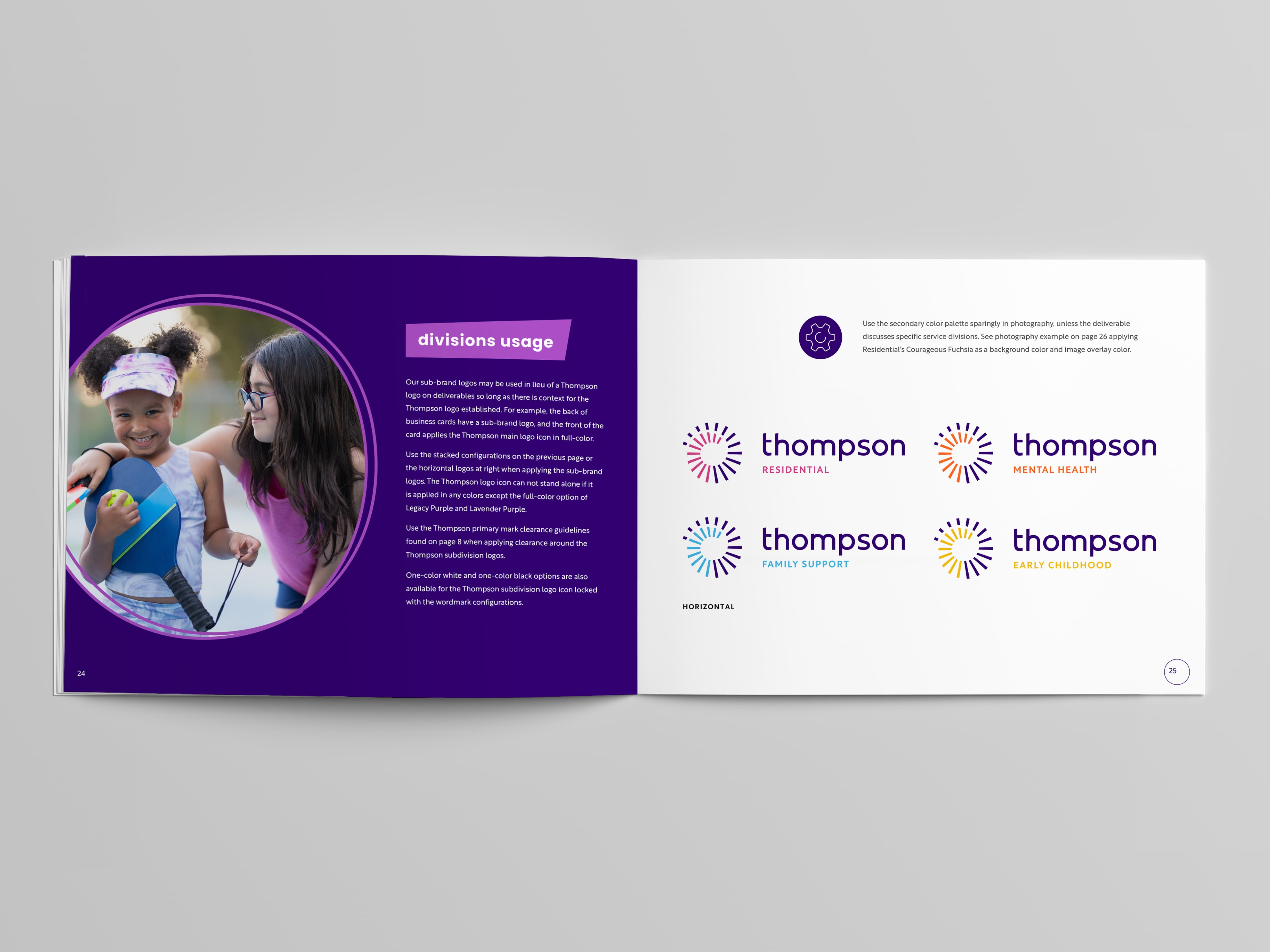
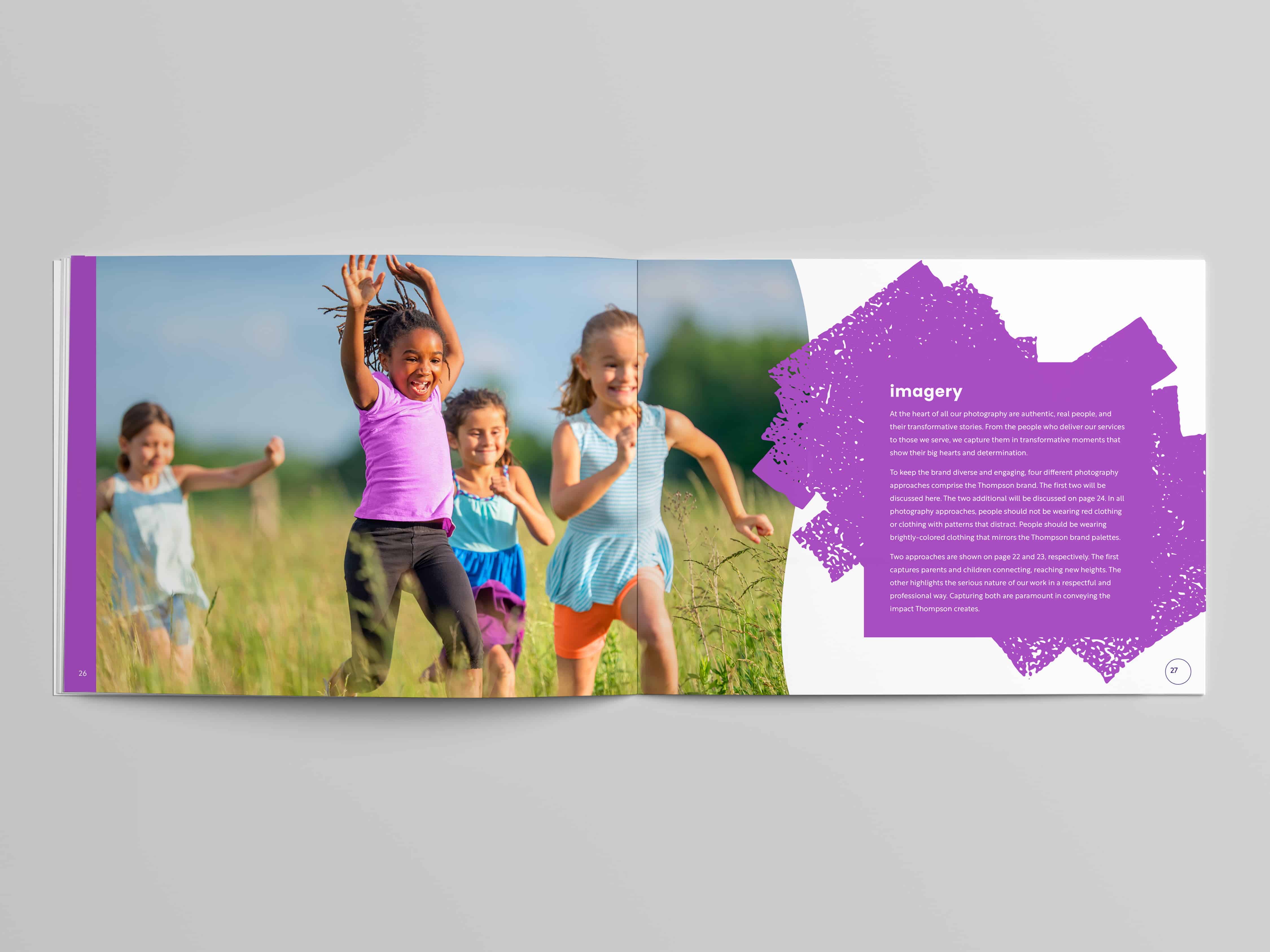
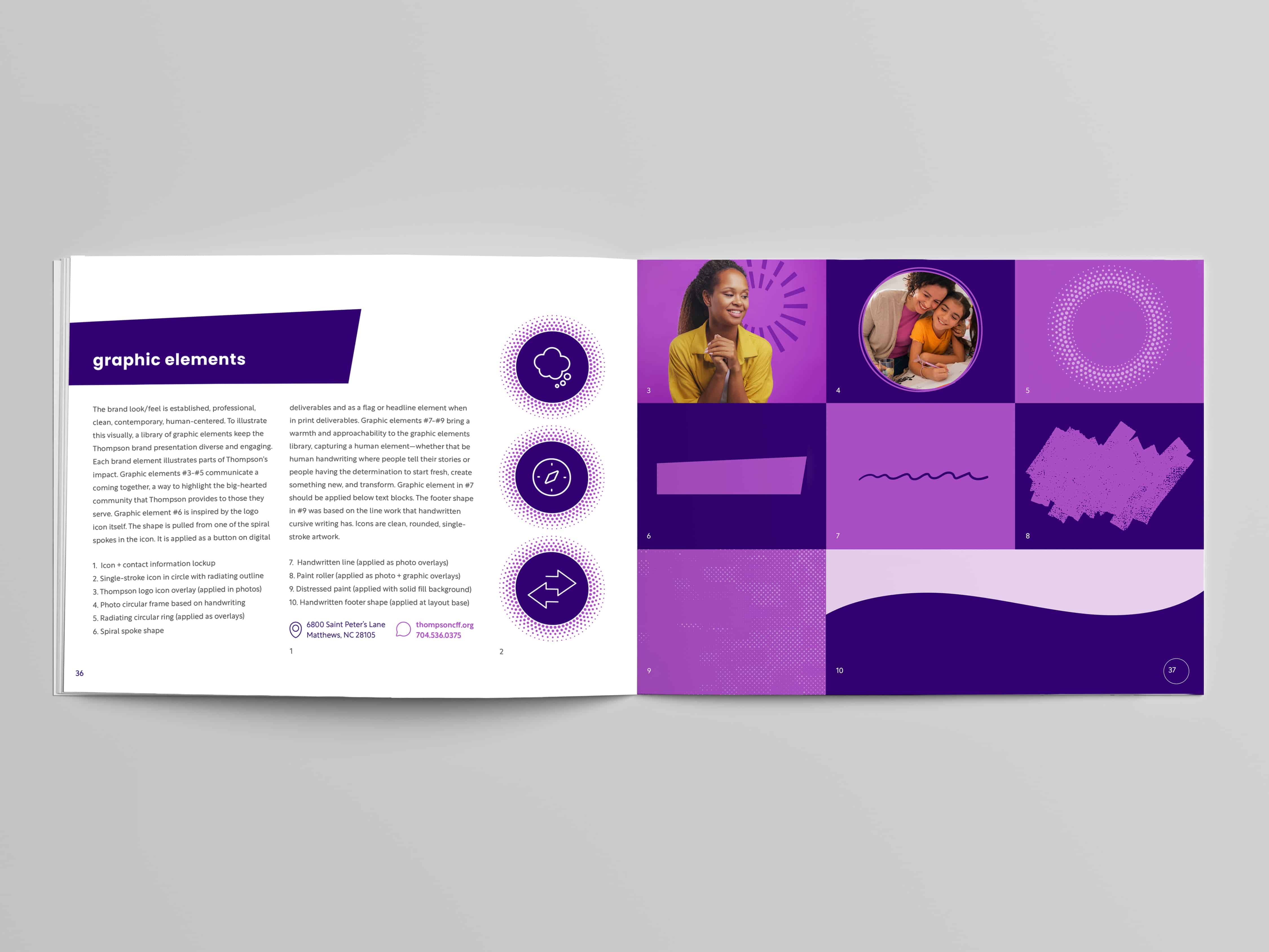
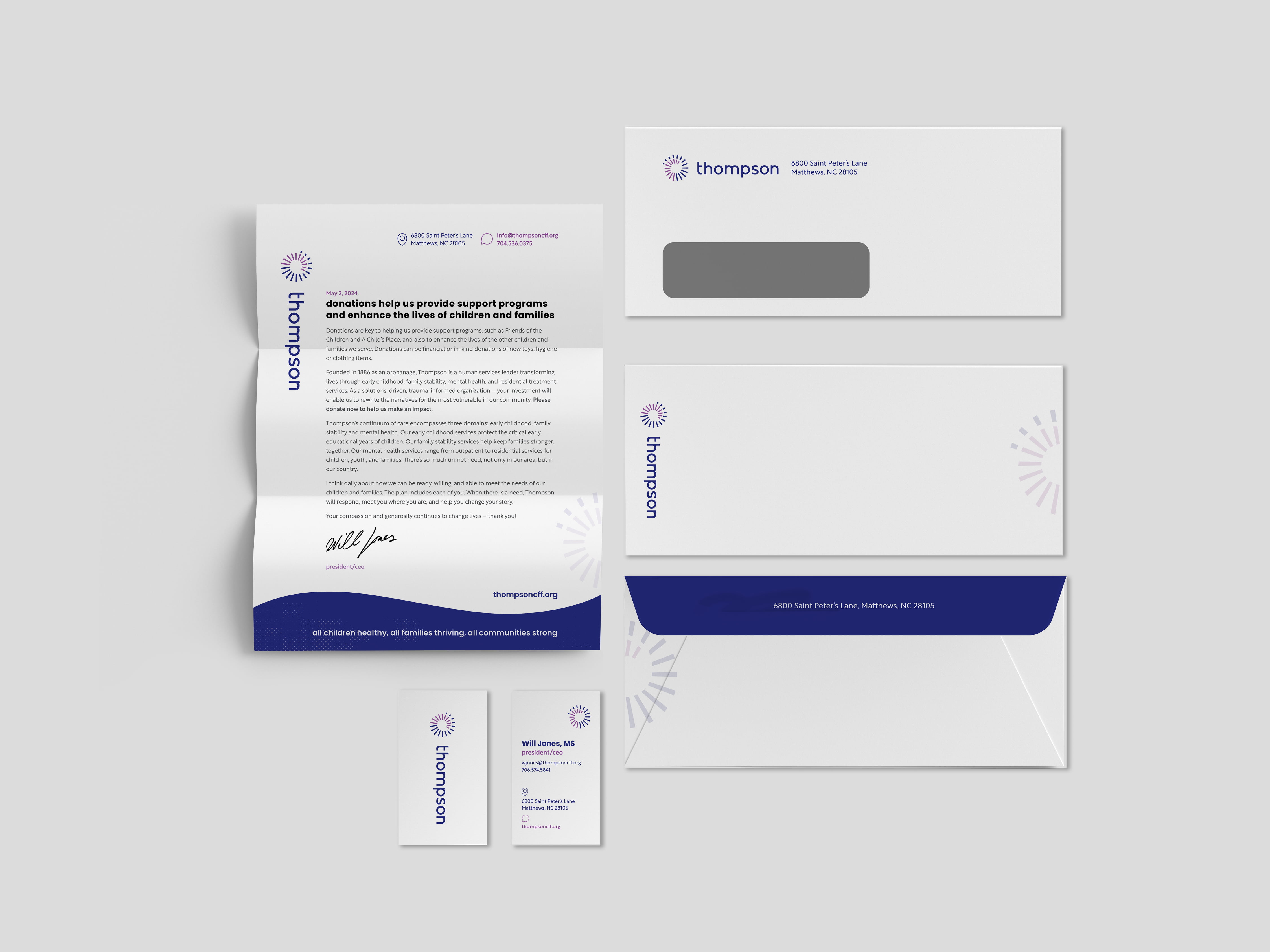
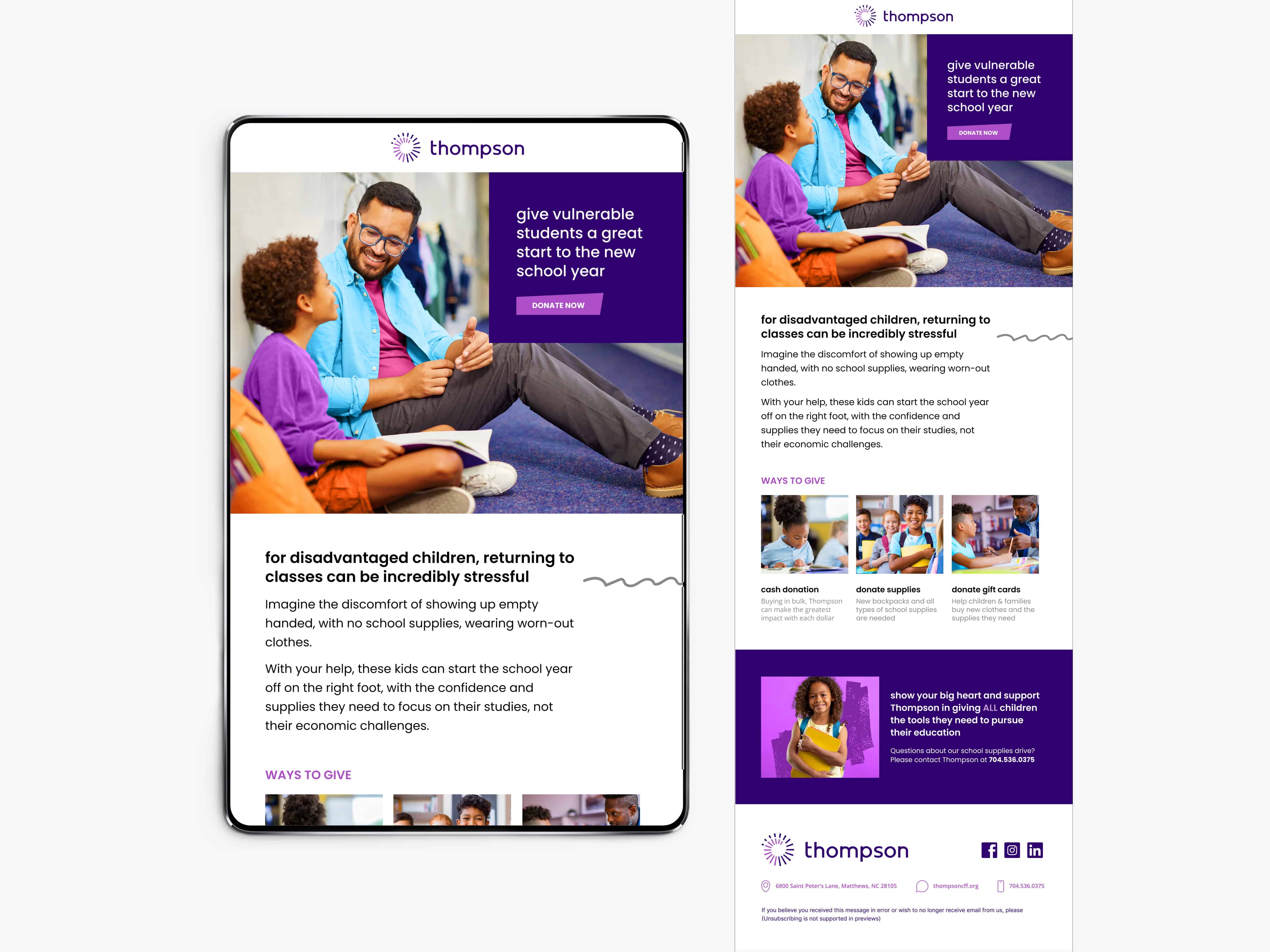
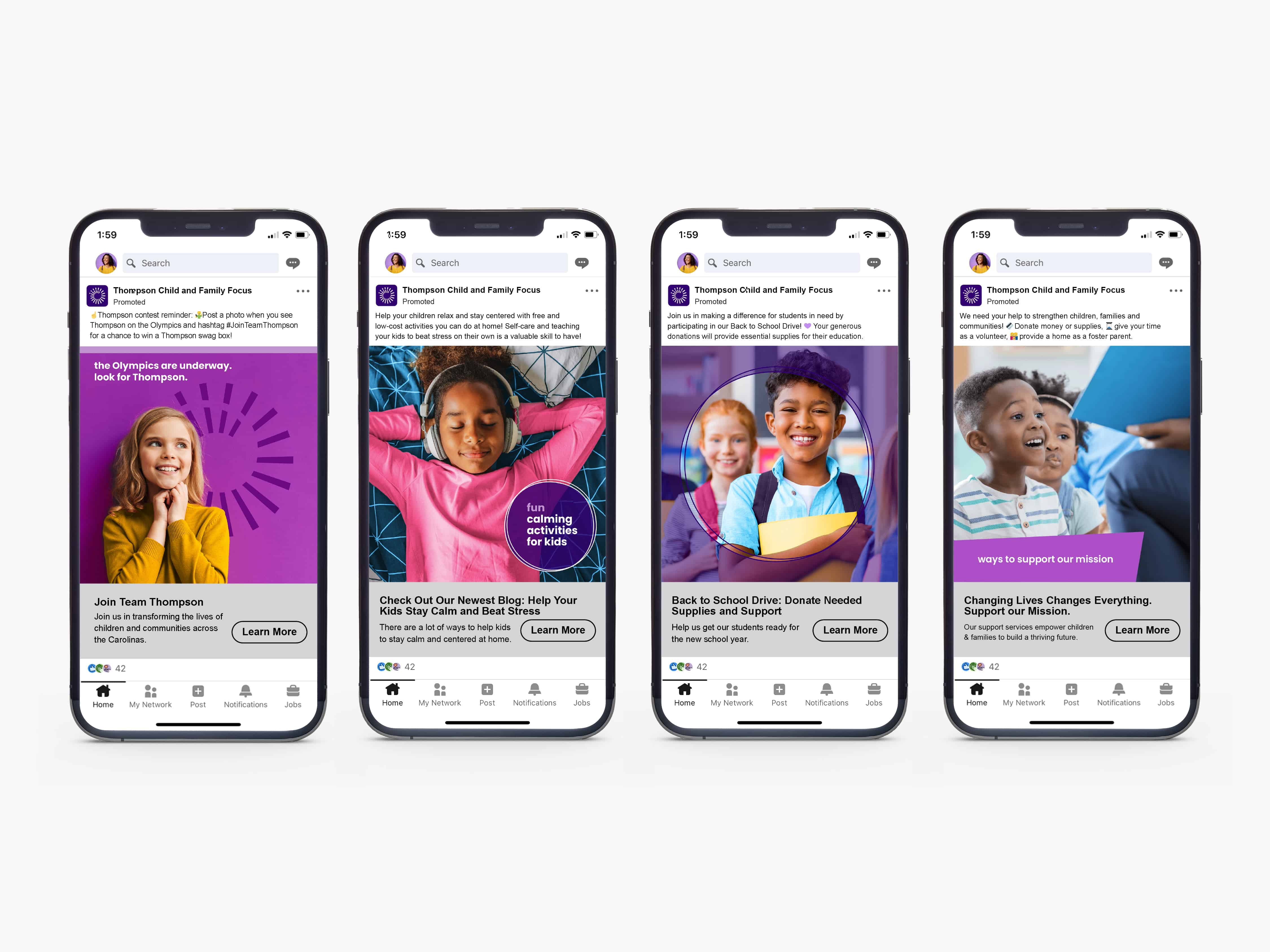
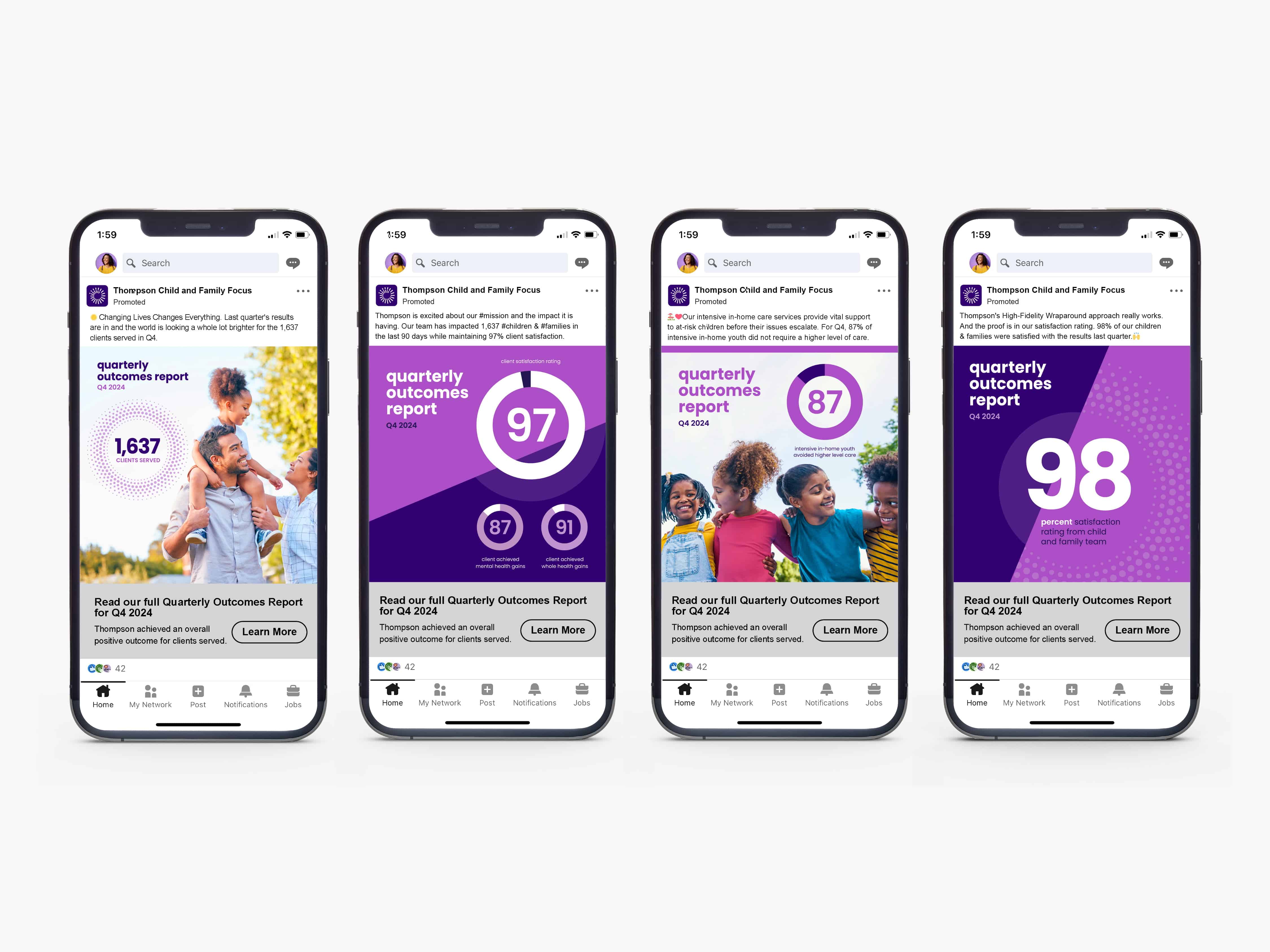
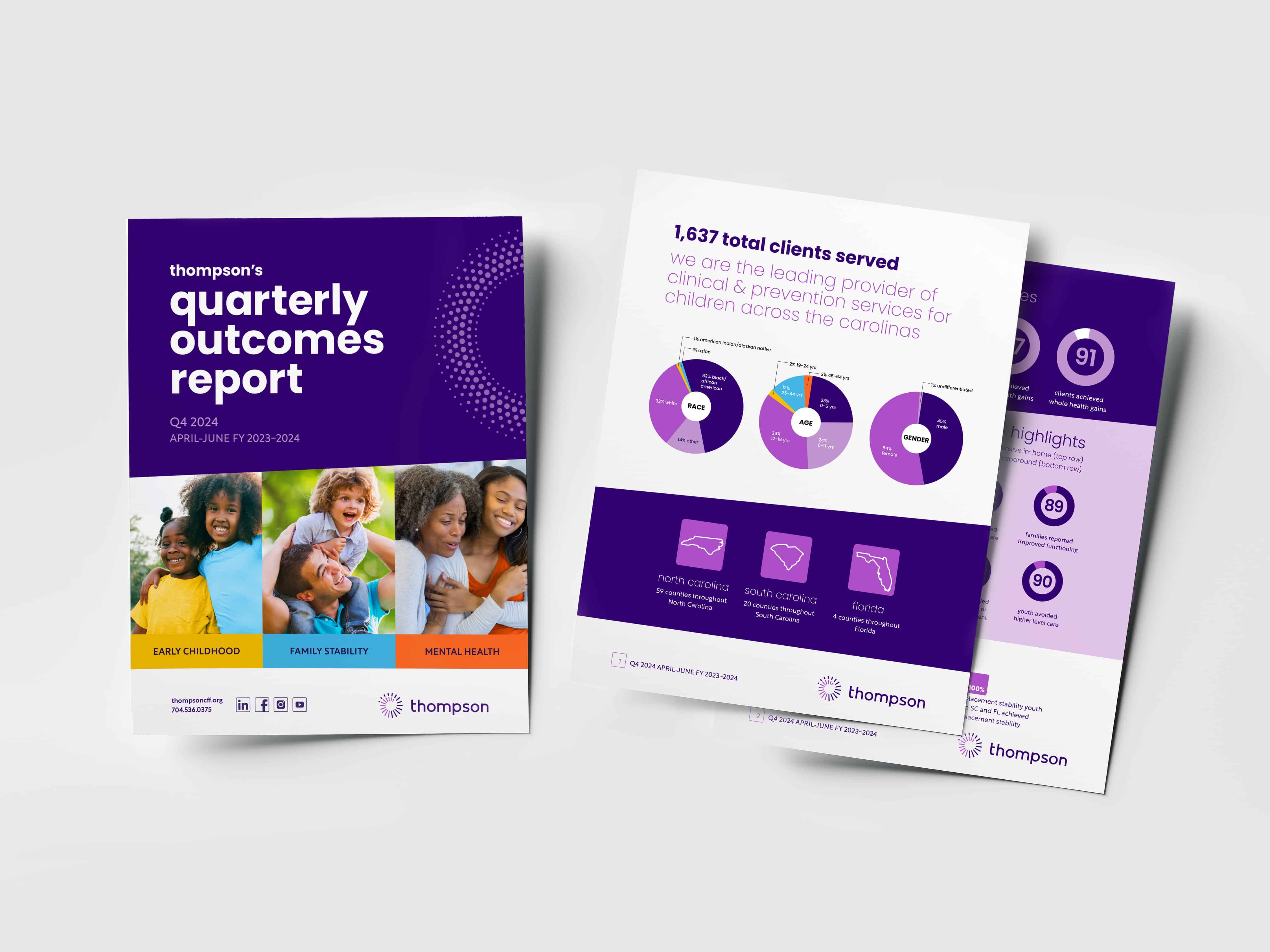
While Thompson is proud of their history, they have grown beyond that legacy and wanted to be redefined. Therefore, Thompson sought to rebrand the organization, keeping their name and dark purple color but starting with a clean slate otherwise. A brand strategy, new logo, division logos, brand guidelines, collateral, and brand awareness campaigns were developed and designed.
Company // BRK Global Marketing
Role // Graphic Designer
Deliverables // designed logo, produced brand guidelines, designed branded collateral
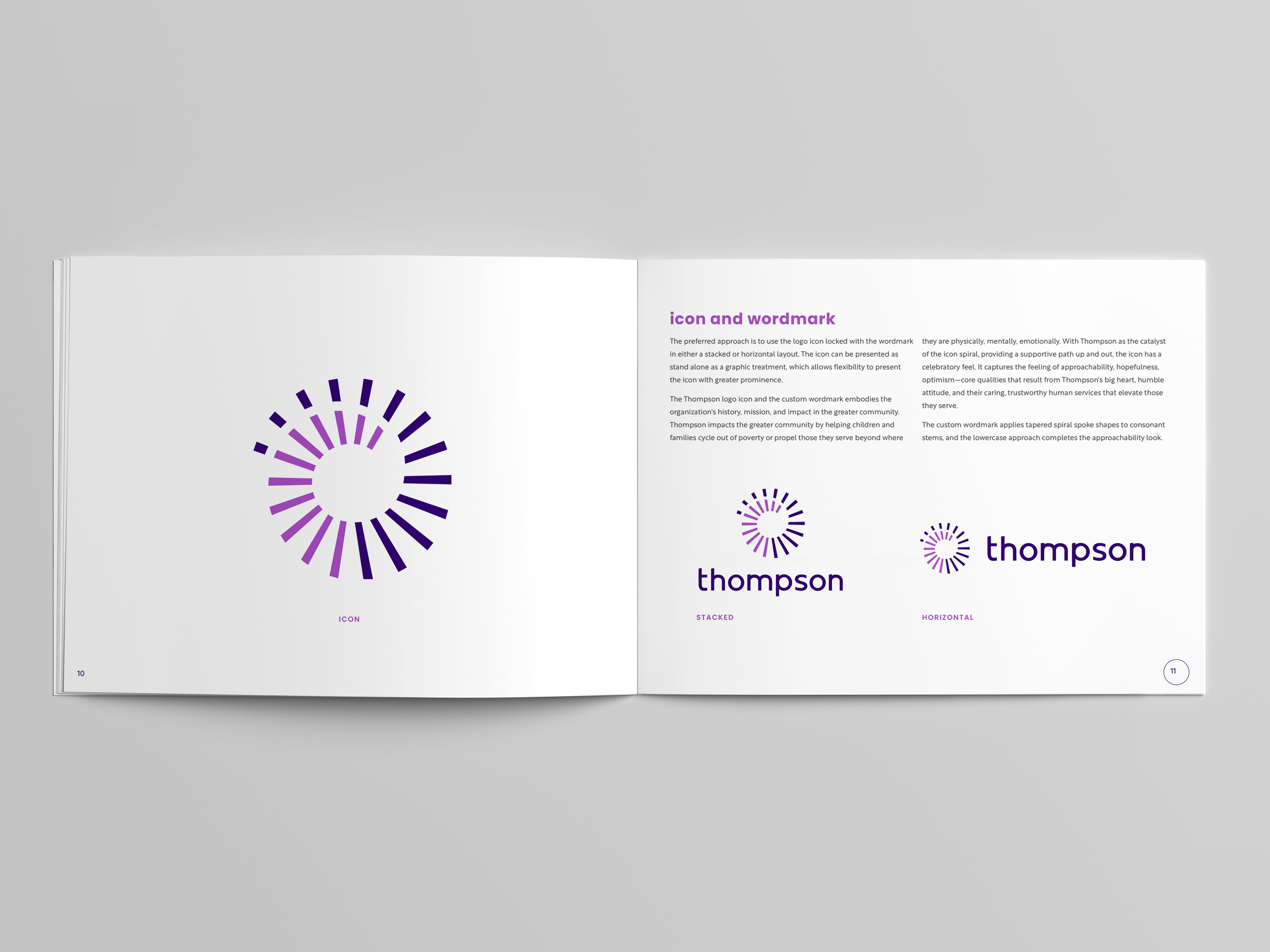
Logo Concept. The icon illustrates the ripple effect of the trustworthy and dependable services have on those Thompson serves. The spiral radiates out from Thompson into the greater community. The spiral also winds back down to Thompson, communicating those they serve can always come back to and depend on Thompson as a foundation of strength. The icon has a celebratory feel and communicates the idea of light achieved with unrelenting determination. The icon can also illustrate Thompson’s impact on helping those they serve cycle out of poverty. The custom typography applies tapered spiral spoke shapes to consonant stems, and the lowercase approach completes the approachable feel.


Previous Logo. For comparison, this is the existing logo Thompson had before any design work was completed for the rebrand.
BRK Global Marketing ©2024